Gypsy Creams
A Cover Comparison
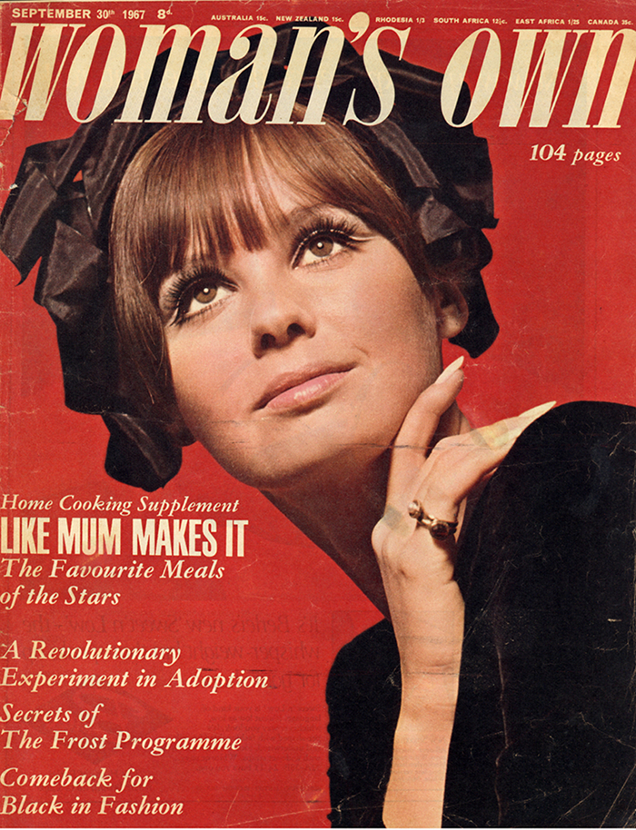
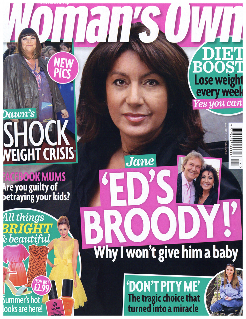
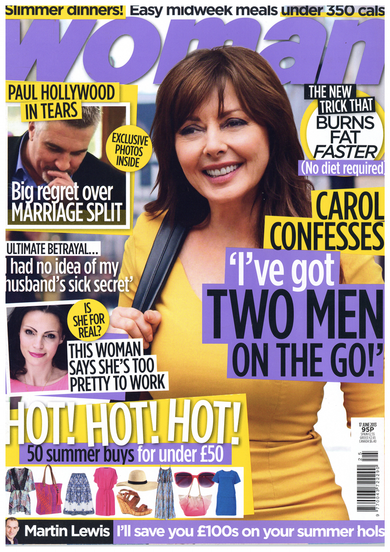
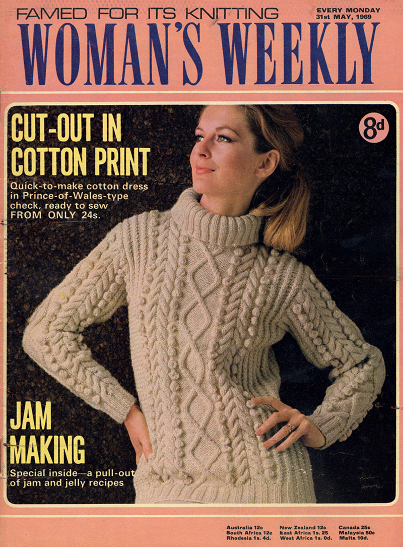
So far, I’ve posted lots of ads and some features from my collection, but I haven’t posted any covers of the magazines referred to. Which is a shame, as there are some stunning examples of composition. Whilst gazing on various covers, it occurred to me that it might be interesting to compare 1960s covers to present day ones. So here they are!
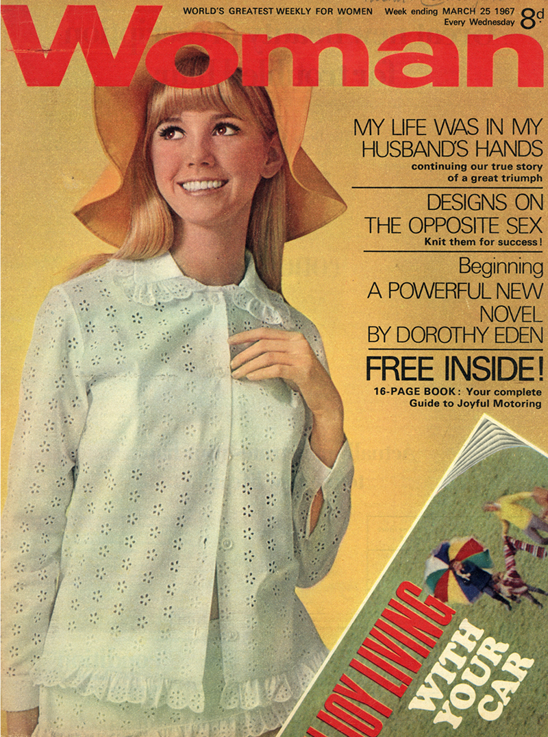
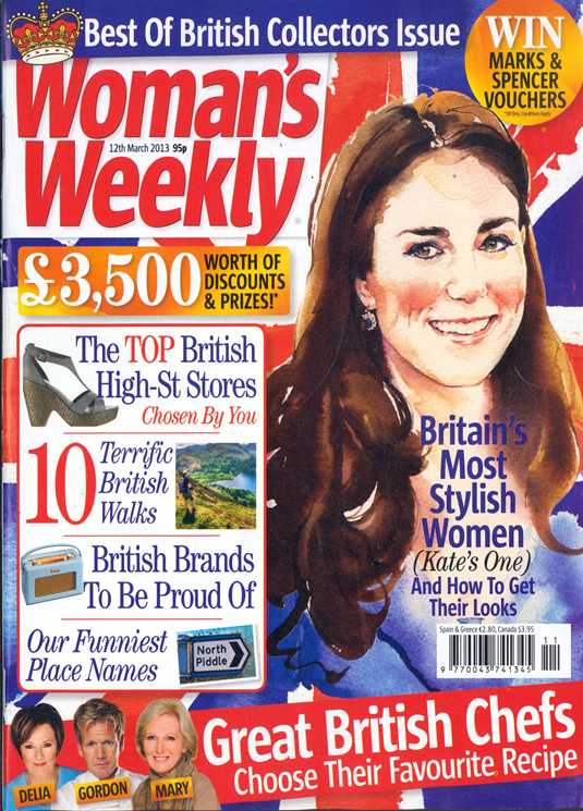
The first point I should make is that, with the exception of Woman’s Weekly, the modern magazines are smaller than their 1960s counterparts. Woman and Woman’s Own were around an A3 size, whilst Woman’s Weekly seems to have always been around an A4 size, which, judging from a 1970s Woman I own, became something of an industry standard after the 1960s.
The obvious difference, however, is how BUSY modern magazine covers are. Whilst large photographs of models, professionally framed, grace the 1960s magazines, the modern covers are dominated by at least one photograph (or illustration, in the unusual example of the Woman’s Weekly), of a celebrity. My 1950s & 1960s collection rarely feature a celebrity, and the only example I can recall is Woman’s Own, with a rather fawning feature on Princess Anne and a celebration of Prince Charles’ investiture as Prince of Wales. Obviously, these magazines reflect the times in which they were produced, so although Britain still seems obsessed with its royal family, it’s also now obsessed with celebrity, which I probably didn’t really need to point out.
However, there’s another trend which wasn’t quite as prominent in the 1960s; greater competition. Although the outlook in 2014 is not particularly positive for print media, it’s fair to say that print magazines still reflect the explosion in titles that came about in the 1990s. With the advent of cheaper professional level production, it became more difficult for well-established magazines to retain readership, what with cheaper titles coming onto the market. I certainly remember something of a bonanza on free gifts around that time, such as pens, diaries and clipboards. What with a generally hostile attitude from newsagents to their customers dipping inside magazines to check what was on offer, the obvious tactic for magazines was to advertise as much of their content as possible on the cover.
And so we come to what I consider a horrible mess. Cheaper production costs and declining revenue seems to have produced what looks like thrown-together covers, full of celebrity gossip and lurid features. I’m probably not their ideal customer, but those magazines make my eyes hurt on the newsstand. I do understand commercial pressures, but I do wonder just how wise it is for Woman and Woman’s Own to try and chase down the audience for Take A Break and their ilk, when they’re already catered for. Woman’s Weekly has, by necessity, long abandoned their dressmaking patterns for what seems to be a mature audience, but all of this highlights a sad fractioning of the market. After all, I’m a woman in my 30s, who ought to be a prime customer for womens’ magazines, but I’d bite someone’s hand off if they offered me a magazine with a cover like the 1960s Woman’s Own featured here, because it suggests a quality product with thought behind it, rather than a photo collage of Loose Women presenters with lurid celebrity stories. I’m hardly a snob (my TV watching habits would horrify The Guardian), but I do appreciate a magazine written by people who have an interest in what they’re talking about. I never thought I’d start wearing make-up until I started reading Sali Hughes’ Guardian columns, for example. There seems to be very little for me on the newsstands.
But what do YOU think, my wonderful public? Let me know!
Tags: social history
No Comments Yet
There are no comments yet. You could be the first!